Let's just ignore the fact that I last posted six months ago.
Today in brush-painting class, we worked on pareidolia, looking at random jumbles of ink and loosing the pattern-hungry human brain to see something meaningful that can be developed. I really like a lot of art made this way; you don't tell the ink what to do, you move with it, like aikido.
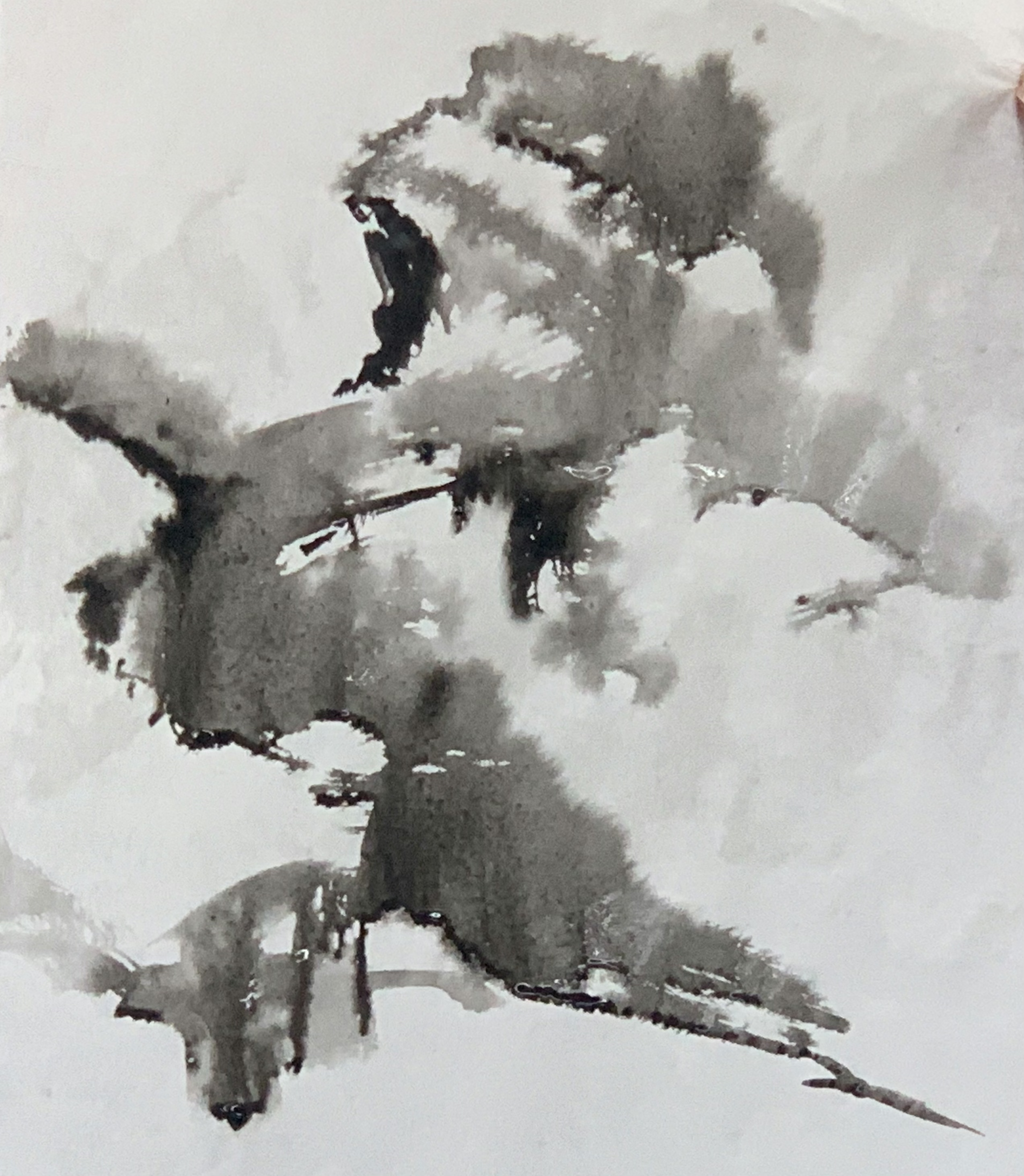
Here's a painting by J. Krogh Colwell, which we like so much a print is hanging in the bedroom, where the artist spilled some ink on the page, looked at it, and saw it wanted to be a mountain scene.

I am delighted by this approach. Not coincidentally, I am really bad at it. My primary artform is cut-paper, so I start with a literal blank sheet of paper, pencil in everything I am going to do, and then cut it. I might revise it a little, but there's always an entire plan. At no point can the art surprise me, and the art doesn't get a vote. I decide what to do and then I do it.
We used sized paper (partially waterproofed by an alum coating) so that the ink can flow over the surface of the paper, rather than immediately attaching to the fibers. The instructor brushed water onto the paper with a flat goat-hair brush, and added some ink by squeezing it out of a mized-hair brush with her fingers, like wringing out a sponge, from a couple centimeters above the paper. Then she tilted the paper around so the ink puddles ran.
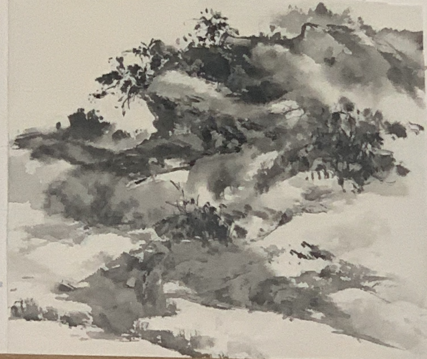
It does not look like anything to me, but she saw a rugged rock, with tufts of vegetation, and set about dancing with the ink.
"Be brave at the beginning," she said, "and gentle at the end."
For this sort of thing, you can add lots of ink at the beginning, when the paper is still wet, and the ink will make foggy soft shapes as it flows into the water. As the scene you saw comes into focus and as the paper dries, you make smaller, sharper, subtler marks.
Here's where she ended:
Then it was the students' turn. Here's how my sportchy flowing ink came out:
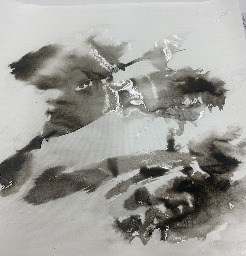
For once, I saw something! I thought the big white shape in the middle clearly wanted to be a mountain, and I could help it with its orogenic ambitions. So first I closed off the weird notch and the open gap at the lower corner of the mountain, and made the bottom of the mountain less perfectly level and more rough and rocky, I hoped. I liked the clean topline of the mountain and didn't want to mess with it.

Then there was that weird vertical, cutting up through the mountain. Made that into a foreground tree. I very carefully twisted the tip of the brush into a triangular shape so the tree was made of little arching boughs, like a cypress, but the initial splortch was still wet enough all my careful triangles bled into a misty blob, and the trunk that went over the vertical line I was trying to conceal got fuzzy and sloppy. Oops.
Then I wanted to add some rock texture to the ground around the trees, so it was less like they were floating in space. I know all these decisions sound really simple and obvious, but I really enjoyed the whole "letting the ink lead" experience so much - normally the ink doesn't look like anything to me, this was great.
I forgot to do a photo at that stage, but it's not a big difference, just some outlining and texture added to the grey blob that's on the other side of the trees from the mountains.
And then I was stuck. I looked at the big white streaks below the mountain, and tried to imagine what sort of landforms they might be. I frowned at the sky above the mountain and tried to see ... clouds? another row of mountains? I waved my paintbrushes back and forth above the painting like I was metal-detecting, imagining strokes I could make. I muttered.
"Brave at the beginning, gentle at the end." The trick was: it didn't need more rocks, more mountains, or clouds. It could be misty and vague and sketchy. The instructor looked over my shoulder and suggested two small changes, and then setting down my brushes: fade out around the weird thin streak in the sky, and darken the lowest ink blob a bit to suggest a cliff, with a flat area on top where the trees are growing.
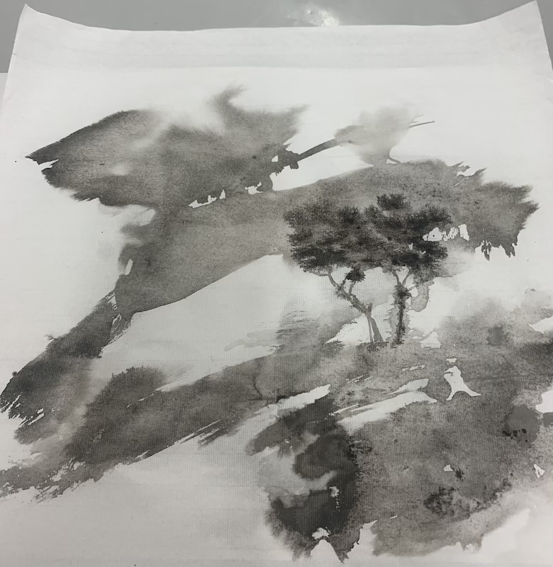
Here's the final piece:

Not, perhaps, a very sophisticated composition, but I found it all by myself, with my very own delightfully malfunctioning human brainmeats, tuned away from what is and toward what isn't yet.
Today in brush-painting class, we worked on pareidolia, looking at random jumbles of ink and loosing the pattern-hungry human brain to see something meaningful that can be developed. I really like a lot of art made this way; you don't tell the ink what to do, you move with it, like aikido.
Here's a painting by J. Krogh Colwell, which we like so much a print is hanging in the bedroom, where the artist spilled some ink on the page, looked at it, and saw it wanted to be a mountain scene.
I am delighted by this approach. Not coincidentally, I am really bad at it. My primary artform is cut-paper, so I start with a literal blank sheet of paper, pencil in everything I am going to do, and then cut it. I might revise it a little, but there's always an entire plan. At no point can the art surprise me, and the art doesn't get a vote. I decide what to do and then I do it.
We used sized paper (partially waterproofed by an alum coating) so that the ink can flow over the surface of the paper, rather than immediately attaching to the fibers. The instructor brushed water onto the paper with a flat goat-hair brush, and added some ink by squeezing it out of a mized-hair brush with her fingers, like wringing out a sponge, from a couple centimeters above the paper. Then she tilted the paper around so the ink puddles ran.
It does not look like anything to me, but she saw a rugged rock, with tufts of vegetation, and set about dancing with the ink.
"Be brave at the beginning," she said, "and gentle at the end."
For this sort of thing, you can add lots of ink at the beginning, when the paper is still wet, and the ink will make foggy soft shapes as it flows into the water. As the scene you saw comes into focus and as the paper dries, you make smaller, sharper, subtler marks.
Here's where she ended:
Then it was the students' turn. Here's how my sportchy flowing ink came out:
For once, I saw something! I thought the big white shape in the middle clearly wanted to be a mountain, and I could help it with its orogenic ambitions. So first I closed off the weird notch and the open gap at the lower corner of the mountain, and made the bottom of the mountain less perfectly level and more rough and rocky, I hoped. I liked the clean topline of the mountain and didn't want to mess with it.
Then there was that weird vertical, cutting up through the mountain. Made that into a foreground tree. I very carefully twisted the tip of the brush into a triangular shape so the tree was made of little arching boughs, like a cypress, but the initial splortch was still wet enough all my careful triangles bled into a misty blob, and the trunk that went over the vertical line I was trying to conceal got fuzzy and sloppy. Oops.
Then I wanted to add some rock texture to the ground around the trees, so it was less like they were floating in space. I know all these decisions sound really simple and obvious, but I really enjoyed the whole "letting the ink lead" experience so much - normally the ink doesn't look like anything to me, this was great.
I forgot to do a photo at that stage, but it's not a big difference, just some outlining and texture added to the grey blob that's on the other side of the trees from the mountains.
And then I was stuck. I looked at the big white streaks below the mountain, and tried to imagine what sort of landforms they might be. I frowned at the sky above the mountain and tried to see ... clouds? another row of mountains? I waved my paintbrushes back and forth above the painting like I was metal-detecting, imagining strokes I could make. I muttered.
"Brave at the beginning, gentle at the end." The trick was: it didn't need more rocks, more mountains, or clouds. It could be misty and vague and sketchy. The instructor looked over my shoulder and suggested two small changes, and then setting down my brushes: fade out around the weird thin streak in the sky, and darken the lowest ink blob a bit to suggest a cliff, with a flat area on top where the trees are growing.
Here's the final piece:
Not, perhaps, a very sophisticated composition, but I found it all by myself, with my very own delightfully malfunctioning human brainmeats, tuned away from what is and toward what isn't yet.
no subject
Date: 2022-10-06 01:04 am (UTC)